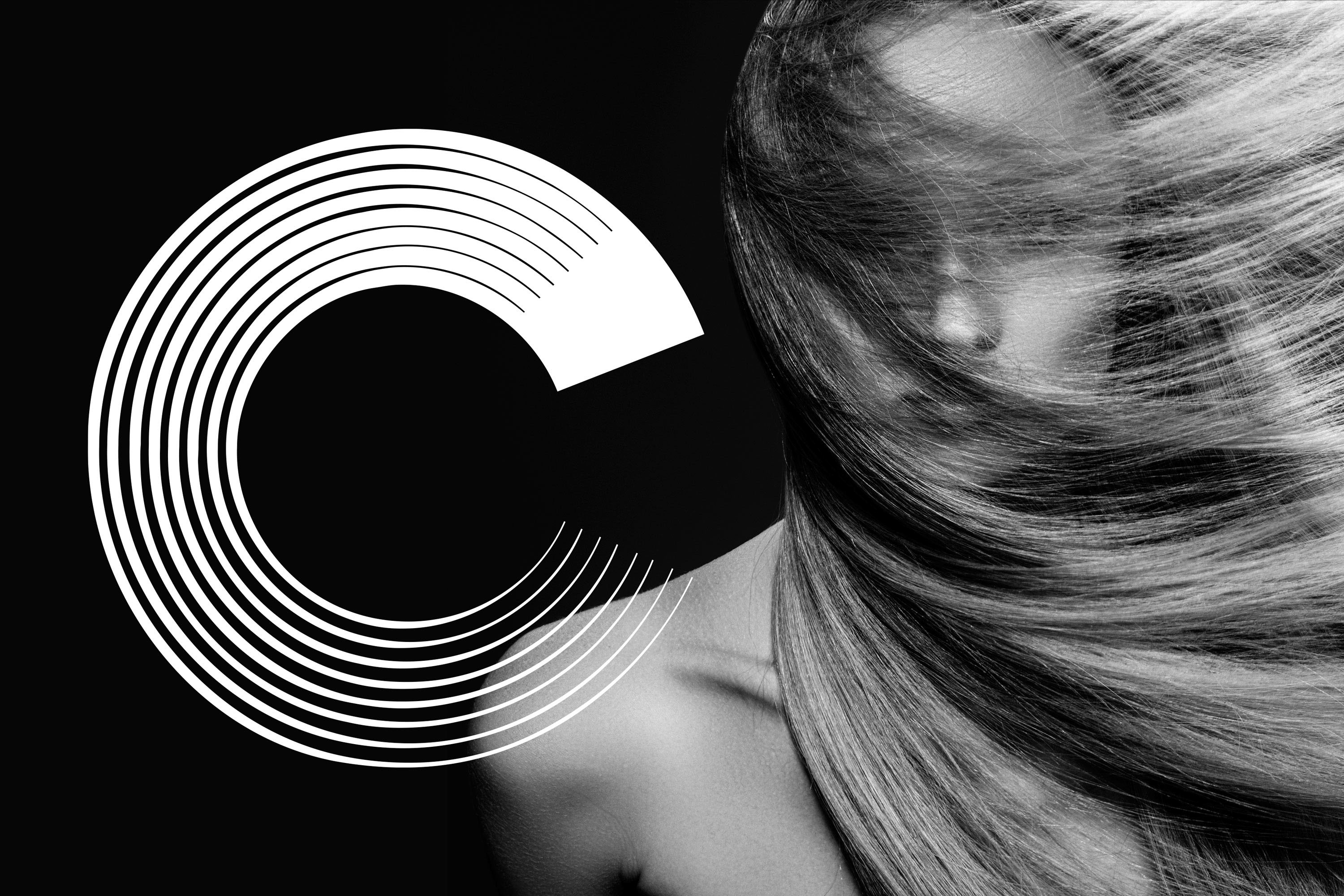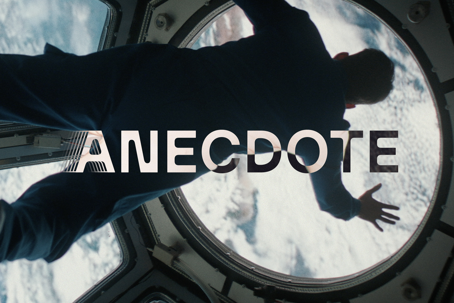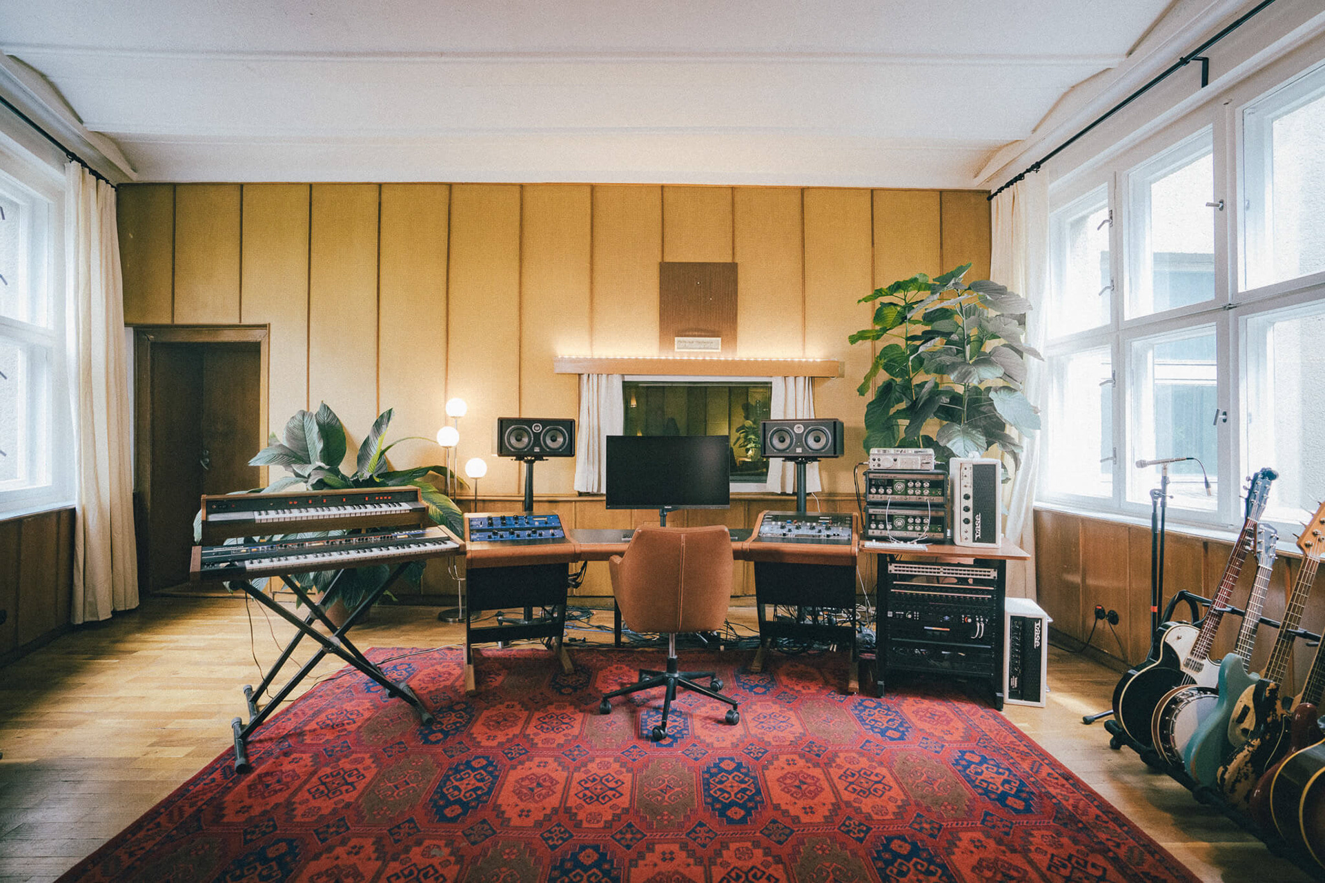
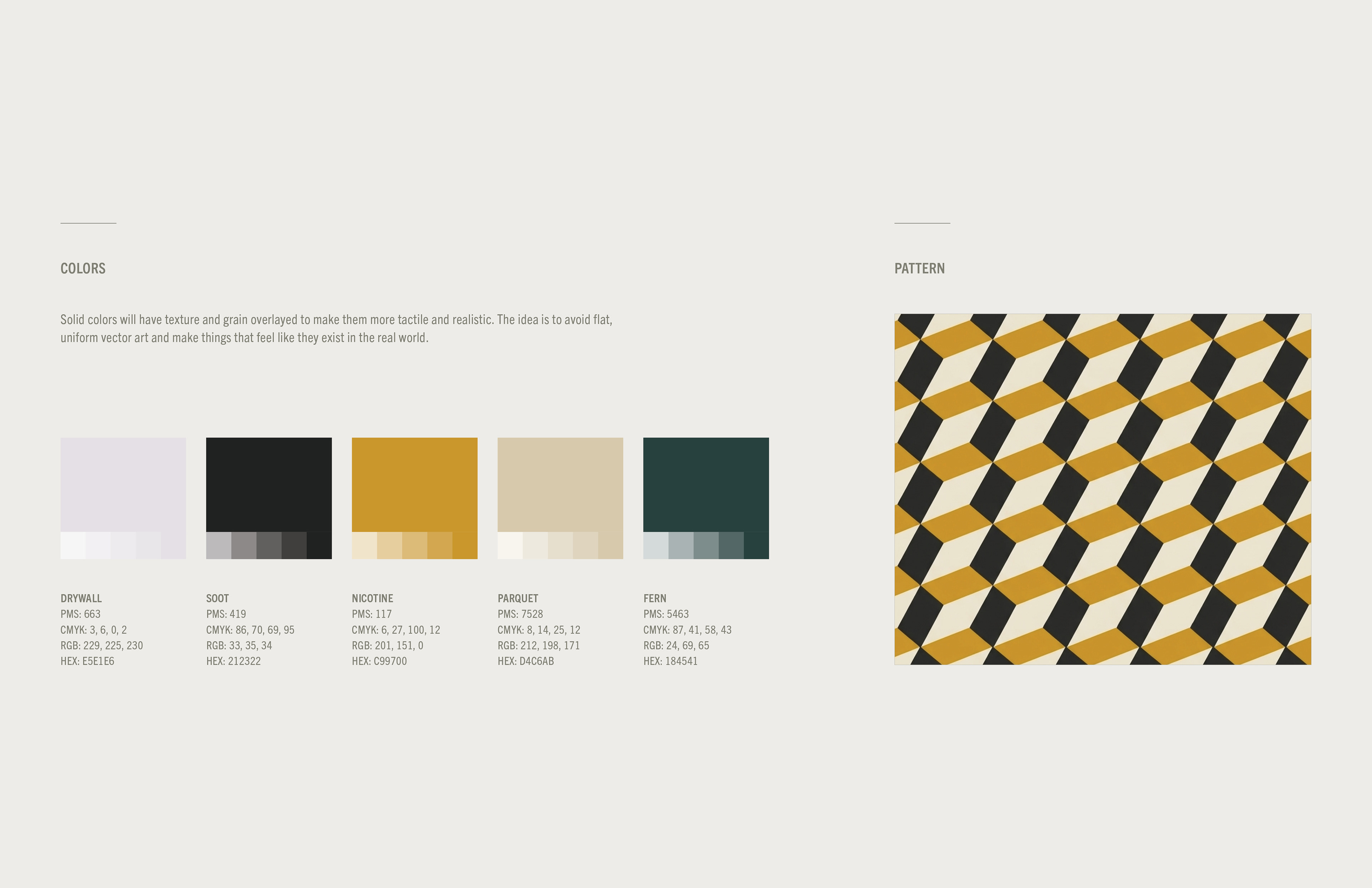
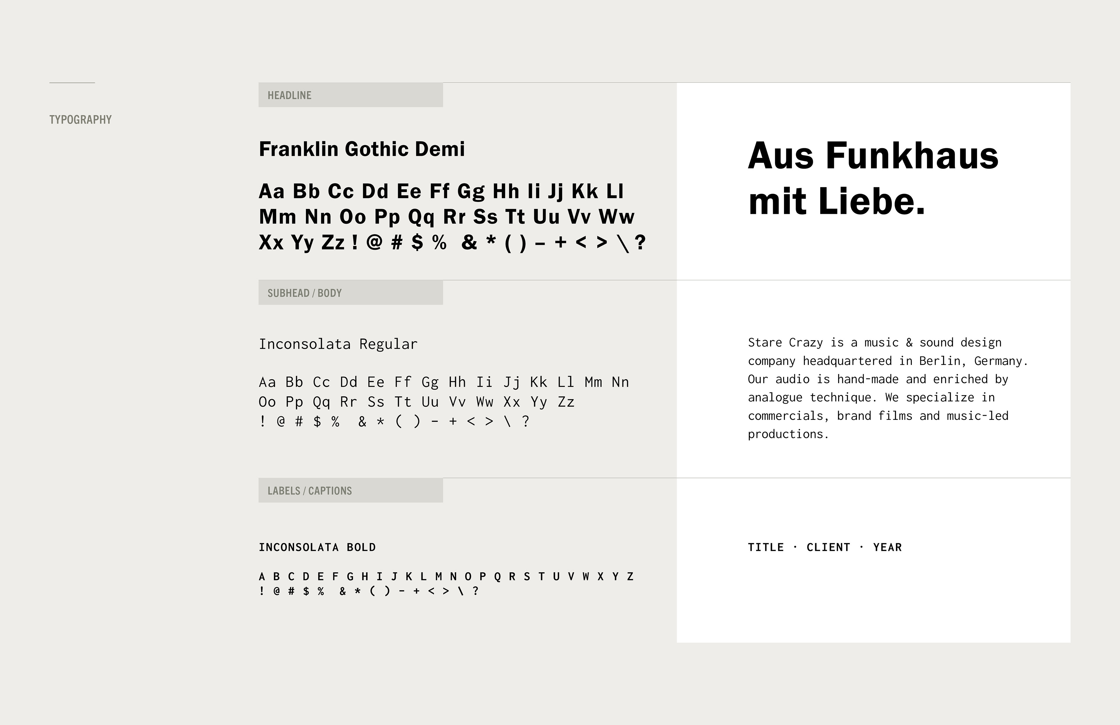
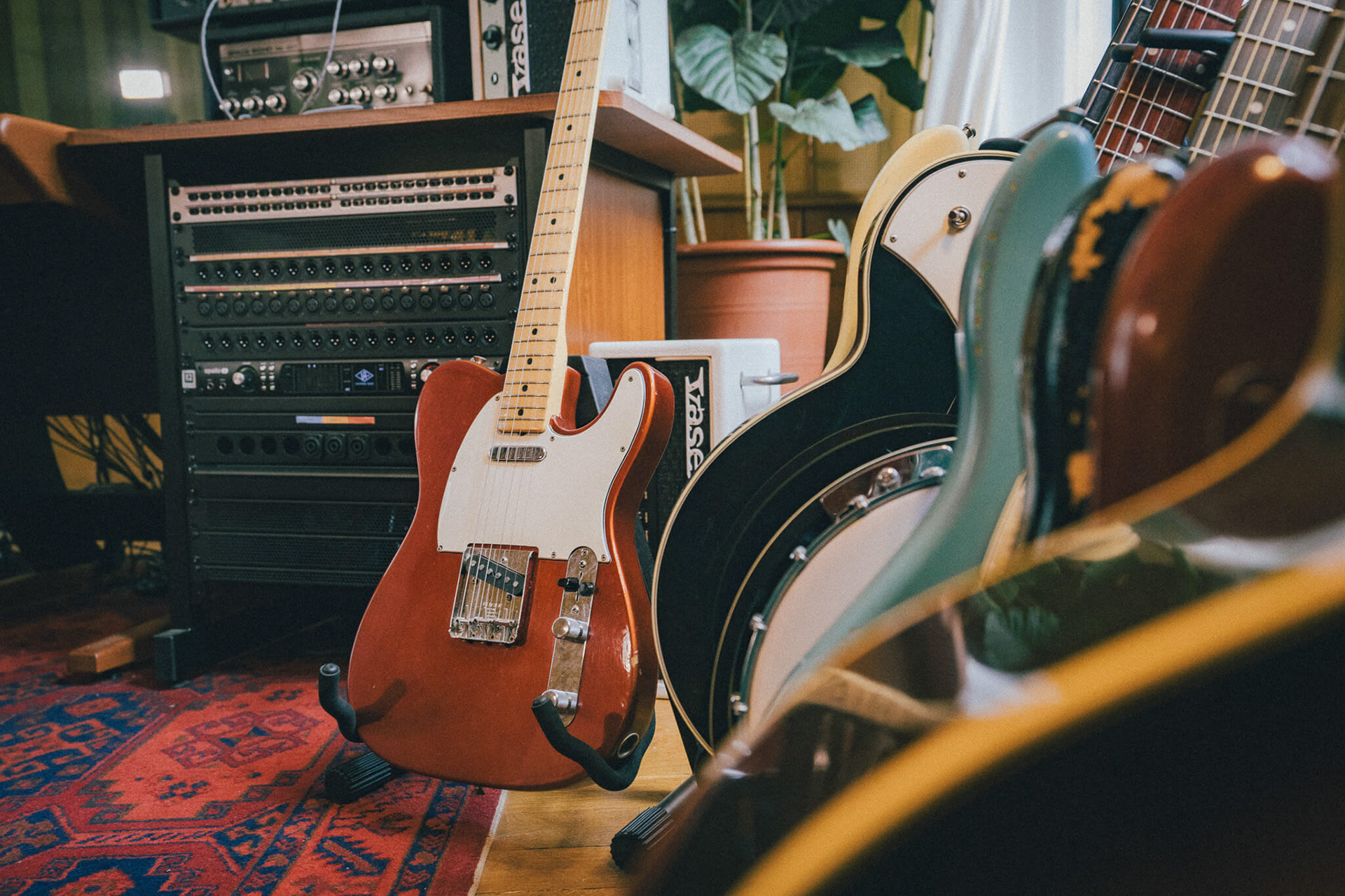
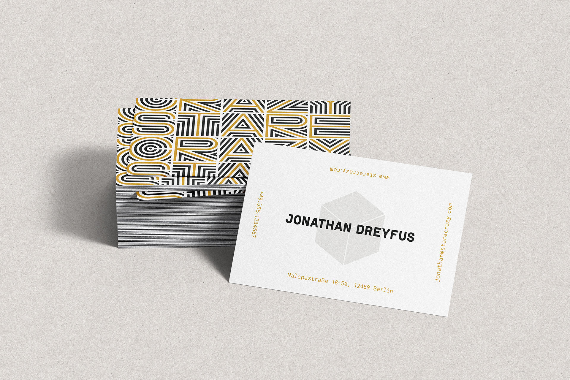
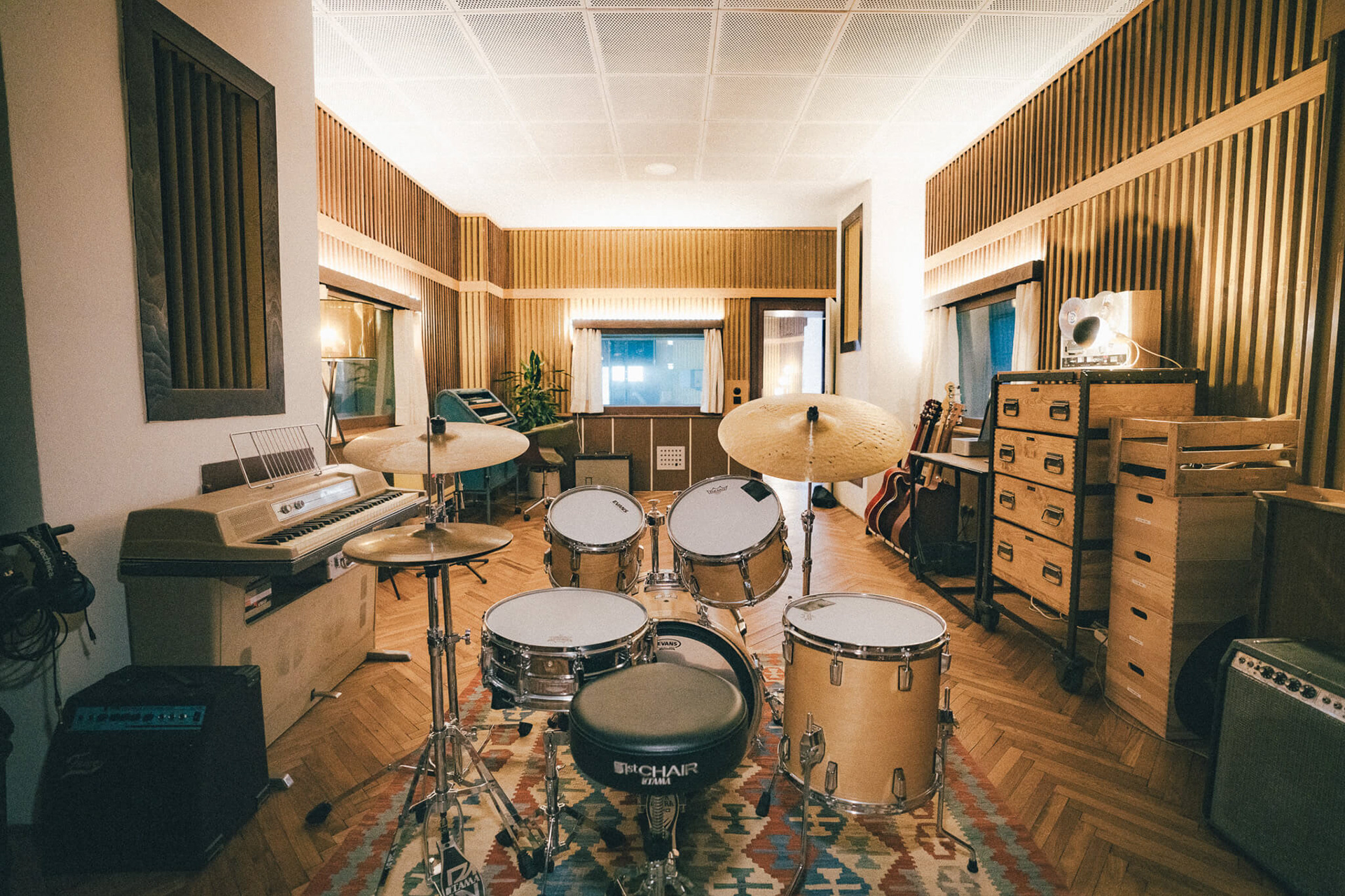
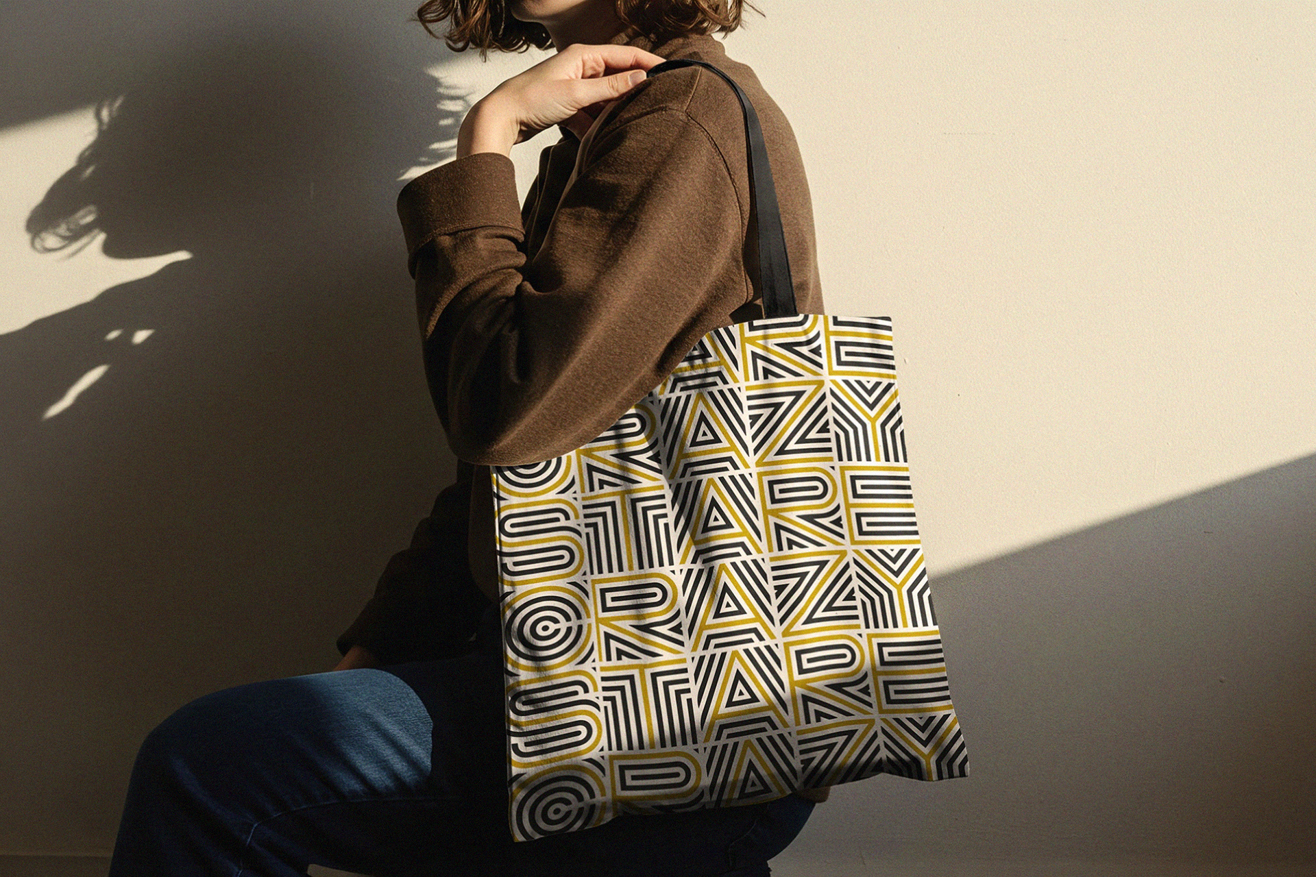
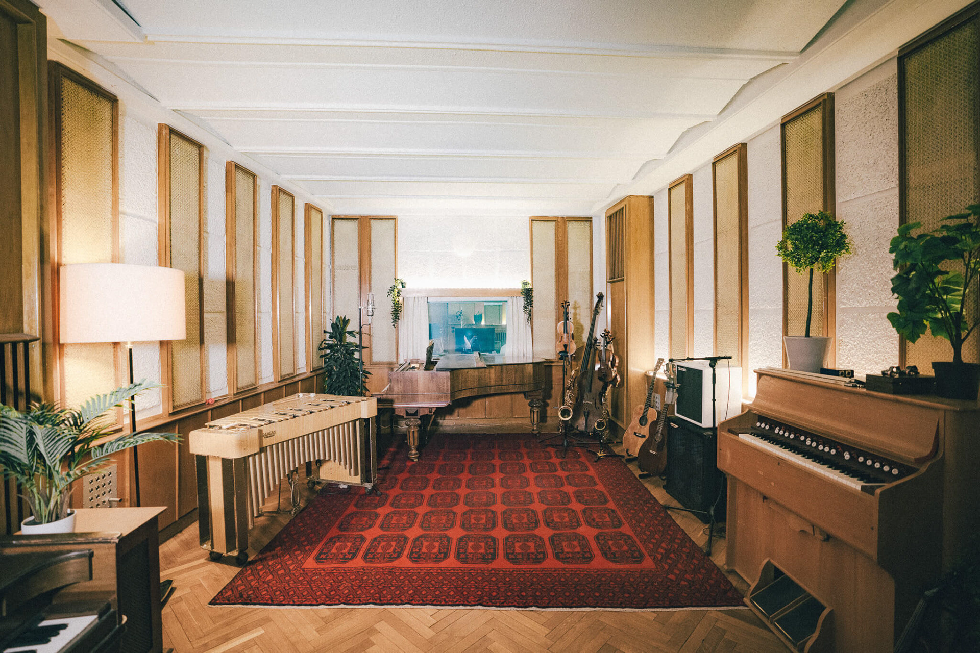
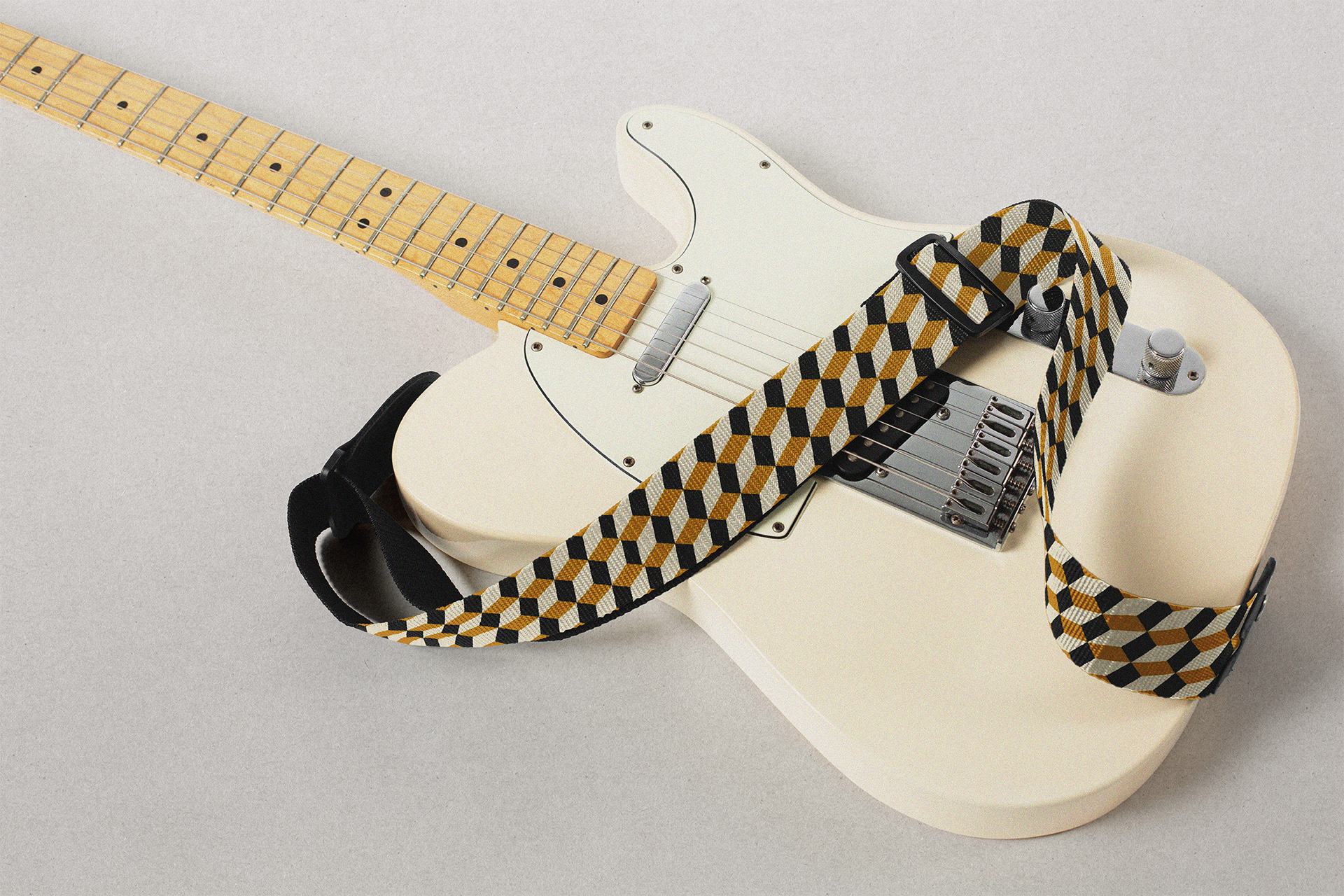
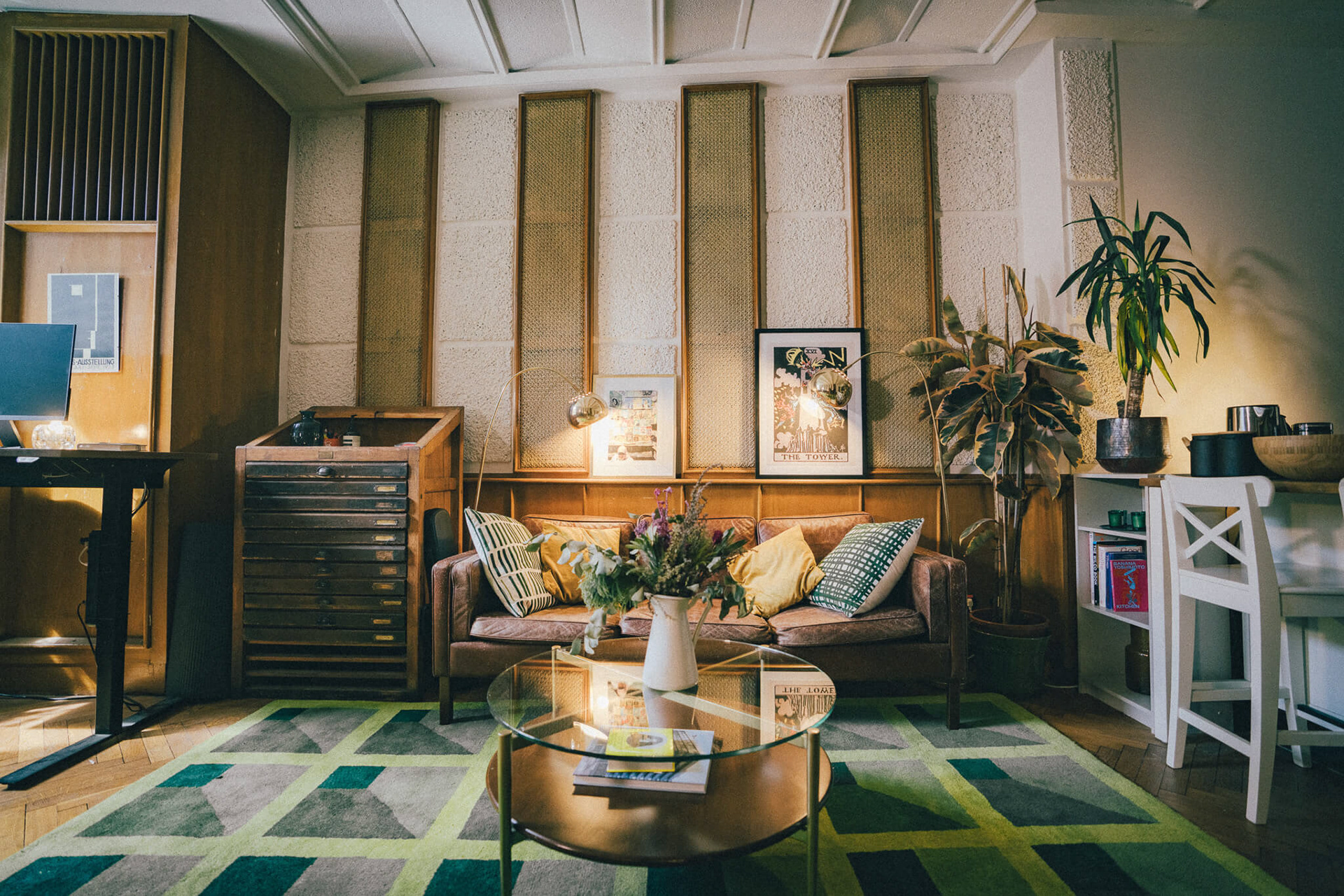


Stare Crazy started as a small group of musicians who saw an opening in the market for bespoke, handcrafted music and sound design for advertising and film. They had the talent, and had already completed high-level projects for large clients to international acclaim. But they had no visual identity to speak of. They needed branding that looked as professional as their product sounded. Their main competitors were large, factory-style music houses engaged in a race to the bottom of AI licensing. Stare Crazy's product was the opposite: beautifully crafted, using vintage microphones, live instrumentation, and heartfelt vocal performances, recorded in warmly lit studio spaces at the historic Funkhaus Berlin. Knowing this philosophical difference was their strongest selling point, I began crafting a brand system to match. After research and brainstorming, I settled on a logo concept built around optical illusions, double vision, and blurry or otherwise obscured forms. This was a way to tie in the company name (which itself was a nod to the visual impairment of one of Stare Crazy's founders). Eschewing conventional wisdom, I decided against a rigid approach, and began building a library of logotypes, arranged by hand with gestural, organic shapes and rich, filmic textures — at times chaotic, but engineered for legibility and usability. The logo was allowed to shift with the creative whims of the team (these are quirky musician-types after all), or to be used selectively depending on the deliverable. The forms were free to change, but the feeling was unmistakably theirs. Inspired by the architecture and wood hues of the recording spaces, I developed the warm, muted colors and patterns that would carry across digital and print. Vintage letterpress and wood type informed the choice of Franklin Gothic as the main typeface, paired with monospaced Inconsolata to bring it into the digital age. With the brand system in place, I developed stationery, internal and external communications, and oversaw multiple photo shoots of the studio spaces, which became the raw material for the website, pitch decks, and presentations. As the company grew and took on larger projects, I maintained consistency and brand integrity, helping to earn them the respect and consideration their work deserved.